In education, we are obsessed with closing gaps. Gender gaps, gaps between cohorts, the gap between where a student should be and where they currently are. But we can’t close these gaps easily- at least not directly. They are actually chasms, impossible to fill because they are too abstract and just not specific enough. Gaps tell you nothing about individual students. The only way that we can close these massive gaps is by concentrating on the very specific things students don’t know, and the very specific things they can’t do.
The traditional way of closing these gaps is with written feedback, but it is pretty inefficient. Many others have written about some of the problems with thinking of feedback as equivalent to marking (see links at end of post) and in my own post on solving the problems of feedback, I tried to mitigate for these problems, but if so much effort has to go into making marking more efficient, is it actually the best method? If we count up the hours spent marking books by a typical teacher during the week, can we say that this is an effective use of their time? Over the next couple of posts, I will outline how we can use feedback to greater effect, without spending the hours it takes to write detailed comments in books. In this post, I am looking at how we use data days to close real gaps.
Data Days
At Dixons Kings Academy, we have three ‘Data Days’ throughout the year. Inspired by the book Driven by Data by Paul Bambrick-Santoyo, these are days where students don’t come in and teachers look through their class data, discussing with heads of faculty how they can address any problems. These are not meetings where teachers have to justify their data, but ones where they can explore it, spot patterns and identify tangible next steps.
Bambrick-Santoyo suggests starting these meetings with ‘global’ questions, which look at the wider class picture:
How well did the class do as a whole?
What are the strengths and weaknesses? Where do we need to work the most?
How did the class do on old versus new standards? Are they forgetting or improving on old material?
How were the results in the different types of question type (multiple choice vs open ended; reading versus writing?)
Who are the strong and weak students?
Then these are followed up with ‘dig-in’ questions:
Bombed questions- did students all choose the same wrong answer? Why, or why not?
Break down the standards. Did students do similarly on every question within the standard or were some questions harder? Why?
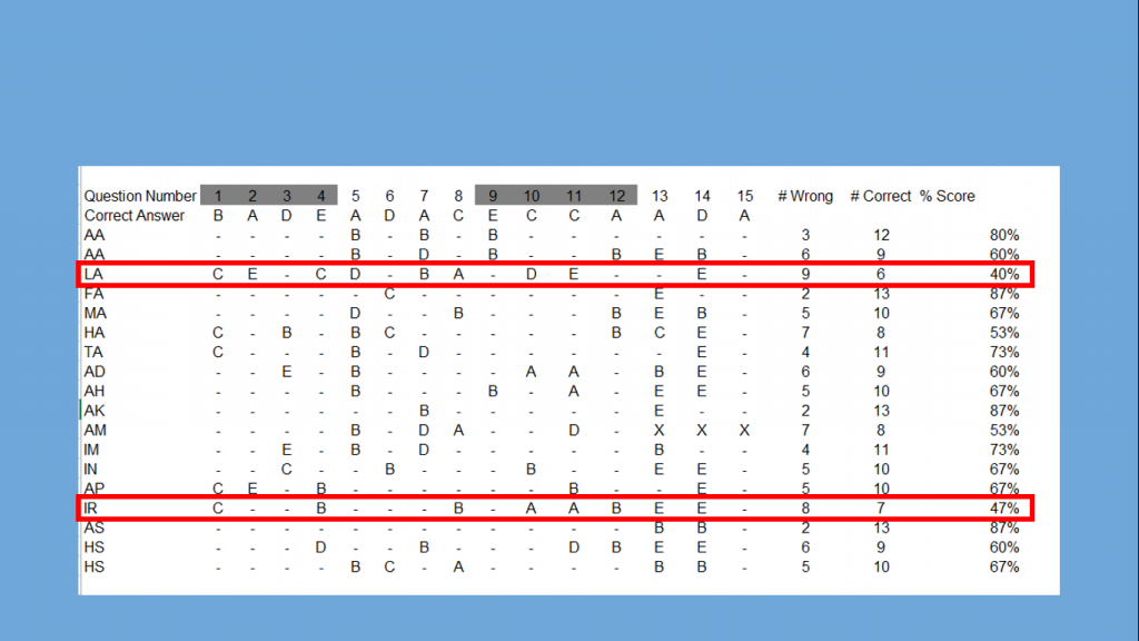
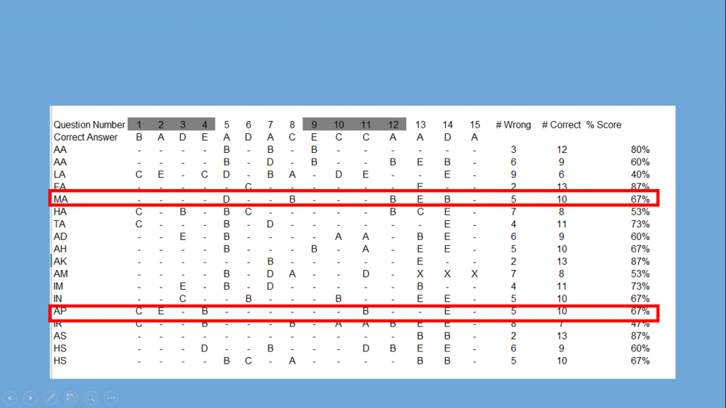
Sort data by students’ scores: are there questions that separate proficient and non-proficient students?
Look horizontally by student: are there any anomalies occurring with certain students.
Assessment design and analysis
It is no use just turning up to these meetings and looking at grades, because grades just don’t tell us anything meaningful- they are not specific enough. They are a starting point, but not much more than that. These meetings are only effective if we have precise and useful information. To get it we have to ensure that our tasks and assessments are designed with this in mind. A well designed assessment tells you much more than simply the grade achieved. It can tell you in exact detail what students can or can’t do or what they do or don’t know- but only if it is designed well. Often, assessments can be arbitrary tasks which we set because we have to. Or we just mark something randomly completed in class: I haven’t marked their books for a while, so I’d best mark this. If we think about some of the questions above, it makes sense that a good assessment will give information at the class level, student level, question level and assessment objective level.
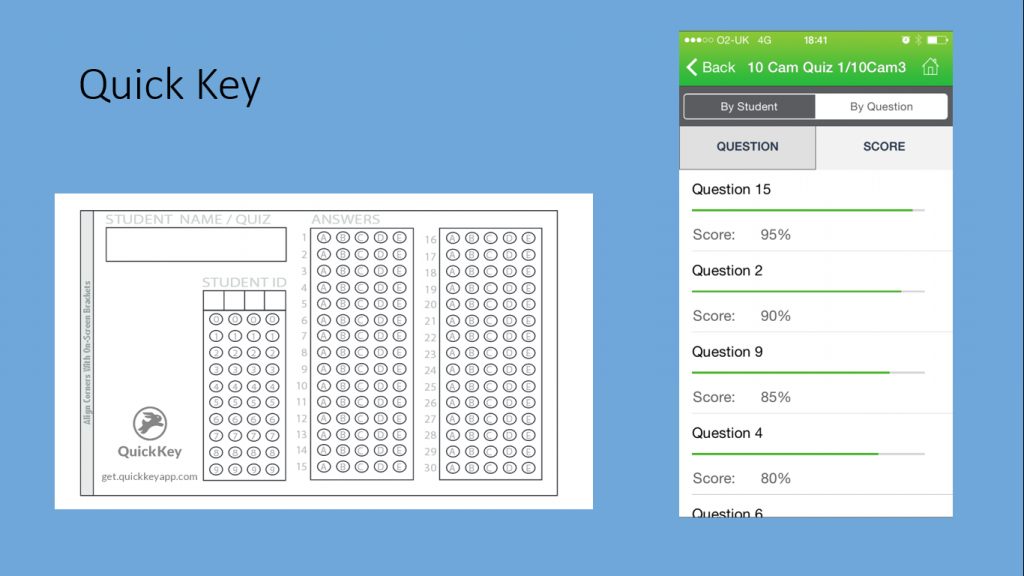
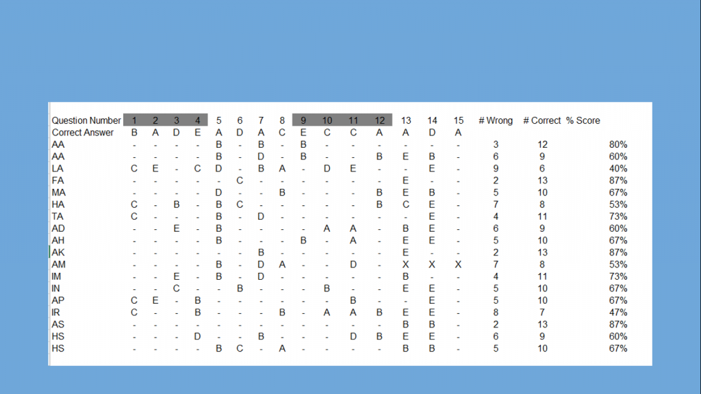
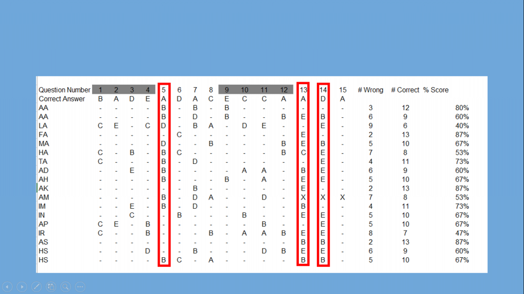
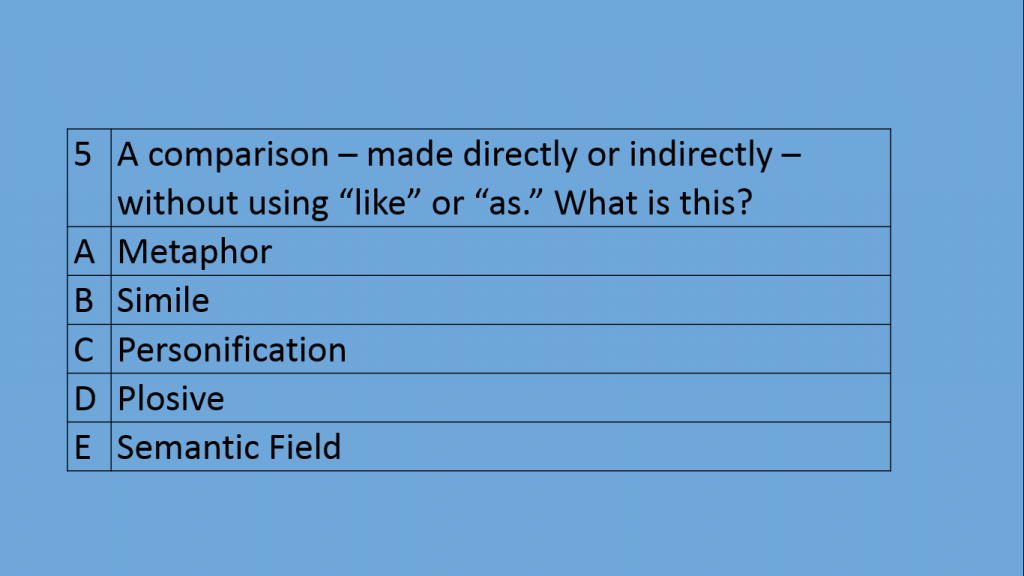
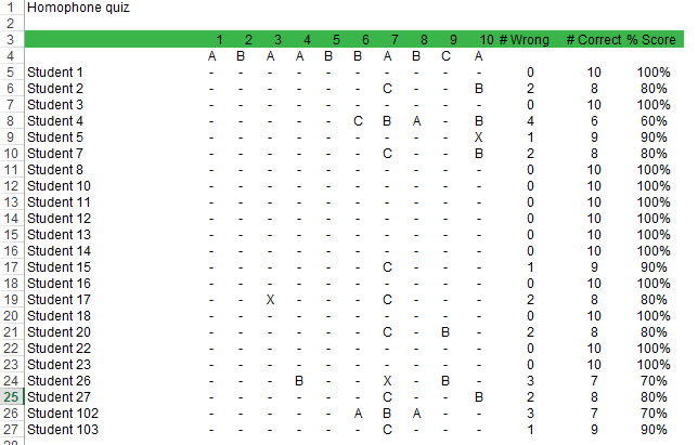
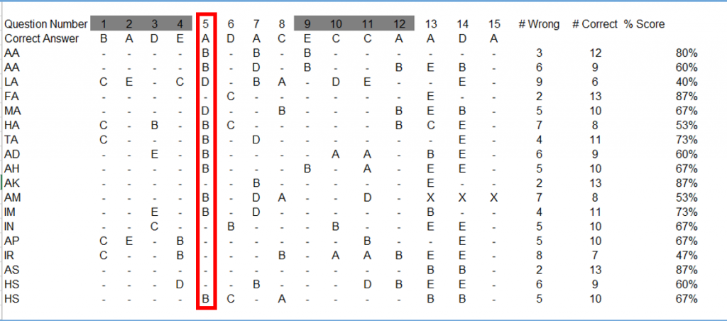 Assessments can be essays, a mix of different types of questions like a Science exam, or could even be a multiple choice quiz. I often use Quick Key as a highly efficient way of using MCQs to get precise information about students. See here for a walkthrough. If multiple choice questions are designed effectively, they can give us exactly the information we need. In this example, showing itemised data from a quiz, we can see a common wrong answer of B. The wrong answer gives me very useful information about a common misconception. With carefully designed plausible wrong answers, multiple choice questions like this can be incredibly rigorous and often inform you far better than an essay would. It might be more time consuming to input question level data manually, but it wouldn’t take more time than writing comments in books. See the links at the bottom of the page for more on question level analysis.
Intervention planning
Once we have drilled down to exactly what to focus on, we spend the rest of the data day intervention planning. These plans need to start from the gaps, not from the students. If we start from the students, then we end up with a massive gap to close and then try to throw things at the gap, ultimately changing very little. By starting with specific things, the gaps can actually be closed.
I used to start with the student; this is from an old intervention plan: “[student] does not always understand the task. He can produce good work when given very clear instructions but struggles without. Seated at front of class for easy support.” The full intervention plan is littered with similarly vague and useless advice. For this one, moving to the front is my plan. Well, if it was as simple as that, we would design classrooms to be all front! For another, the only thing written was: “Irregular attendance. Hopefully this has been addressed.” Despite the best of intentions, no gap was being closed, at least not as a result of my plan.
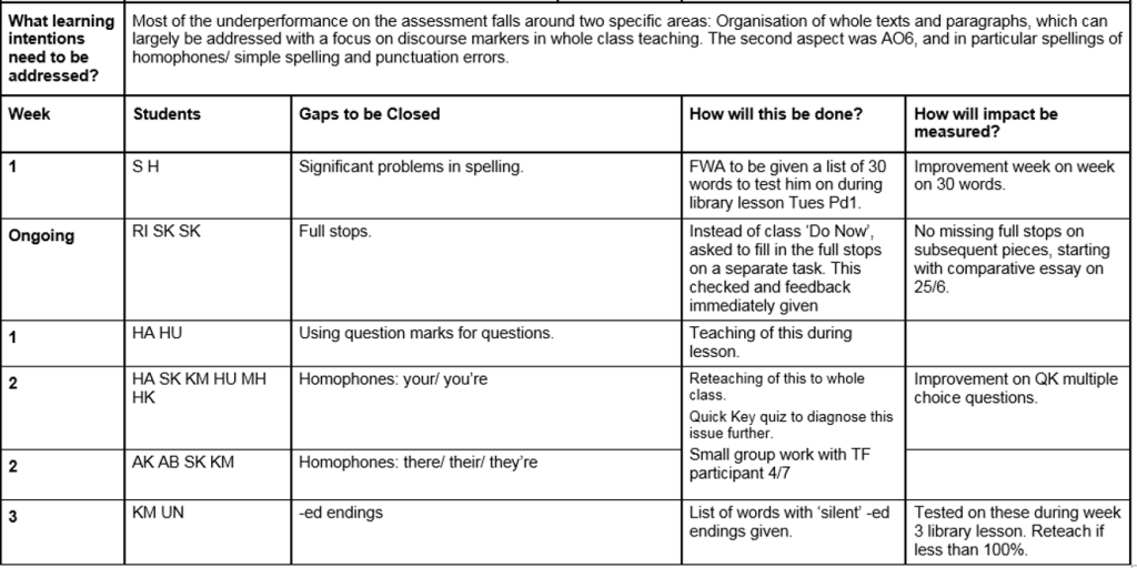 Our intervention planning now starts with the gap to be closed, then the students it affects, then exactly what will be done. Nothing vague. Precise gaps, specific interventions. As you can see, the interventions include different tasks, reteaching, working with other adults etc. There is no guarantee that this closes every gap for good, but at least it is a focussed plan. There are a couple of students on that plan who are not underachieving according to their grade, but have some basic issues that need fixing- these might not be our focus if we started just from the grade. On data day, every teacher produces one of these per class for the following three weeks. The most important thing is that we give teachers time to do it. Time to ask the questions, write the plan and prepare the resources.
Even if data days didn’t exist, the process could still be followed: design effective assessments, ask questions of the data, plan and carry out specific interventions on specific gaps. I contend that the time spent doing this is as valuable as the time spent marking a set of books, and I wonder if this is a more effective proposition. Next time: in-class interventions.
Useful Links
Marking and feedback are not the same from David Didau
Marking is not the same as feedback from Toby French
Is marking the enemy of feedback? from Michael Tidd
Marking is a hornet from Joe Kirby
Exam feedback tool from Kristian Still- this is a timesaving question level analysis and feedback tool
The problem with levels- gaps in basic numeracy skills identified by rigorous diagnostic testing from William Emeny
Is there a place for multiple choice questions in English? Part 1 and Part 2 from Phil Stock